Choosing the right palette can shape how clients feel before their appointment begins. This is why salon owners often ask, “How to choose a color scheme for salon furniture?” The answer involves more than matching chairs to walls. It requires understanding customer expectations, lighting conditions, maintenance needs, and the salon’s daily rhythm.
Leatrice Eiseman, executive director of the Pantone Color Institute, said, “Color is a powerful communication tool and can be used to signal action, influence mood, and even influence physiological reactions.” Her observation is highly relevant to salon design. Warm beige upholstery can make a waiting area feel calm and welcoming. Deep green furniture may suggest natural beauty and wellness. Crisp white surfaces can communicate cleanliness, but they reveal every stain.
Look closely at the room.
Natural light changes color throughout the day. Cool LEDs can make gray furniture appear slightly blue. Glossy finishes may also reflect mirrors, windows, and bright styling lamps. These details can distort an otherwise attractive palette. A sample board viewed at noon may look different at closing time.
Experience matters here. Place fabric, wall paint, flooring, and metal samples together before ordering. Test them beside real hair stations and product shelves. Do not trust a tiny online swatch completely. It is easy to choose a beautiful color that becomes tiring after several hours.
A reliable scheme usually combines one main tone, one supporting shade, and a restrained accent. Still, there is no perfect formula. Some salons need stronger contrast, while others benefit from softer transitions. The best choice remains practical, memorable, and honest about the space’s limitations.
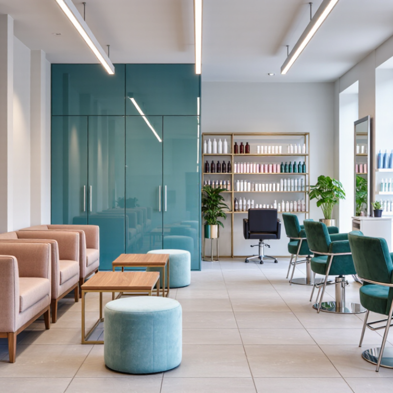
Choosing salon furniture colors starts with a clear emotional goal, not a favorite paint chip. Pantone Color Institute research can translate cultural moods into practical design questions. Do clients need calm, energy, trust, or a stronger sense of luxury? Write one primary goal and two supporting feelings. Keep it measurable. For example, “welcoming and fresh” is more useful than “beautiful.”
In practice, I compare color research with the salon’s lighting, flooring, and service menu. Soft, warm neutrals can make a small reception area feel comfortable. Muted greens or blue tones may support a clean, restorative atmosphere. Stronger colors can create energy, but they may become tiring beside bright task lighting. Always test fabric, vinyl, and painted surfaces during morning and evening hours. Screens are unreliable.
A color forecast should guide decisions, not control them. This is where reflection matters. I once treated a fashionable shade as a complete solution, but it looked dull against the salon’s cool tile. The better choice was a quieter variation with more visual warmth. Sample boards help reveal these mistakes early. Include the wall, floor, furniture material, metal finish, and daylight direction. Then ask whether the colors still communicate the intended client experience. Sometimes the most professional palette feels slightly less exciting. That may be its strength.
The 60–30–10 rule creates a practical structure for salon interiors. Use 60% for the dominant background, including walls, flooring, and large furniture pieces. Soft beige walls and warm gray styling chairs can make a compact salon feel calmer. Keep the main color visually quiet.
Use 30% for supporting furniture and larger functional areas. Reception counters, waiting benches, storage units, and wash stations can carry this middle tone. A muted green or deep taupe adds character without overwhelming the room. Check samples beside mirrors and under your actual lighting. Colors often change after sunset.
The final 10% belongs to accent areas. Choose smaller details, such as cushions, cabinet handles, artwork, or one statement chair. Terracotta, navy, or dusty rose can create memorable points of interest. Keep accents easy to replace. Trends fade.
Material selection also affects the color balance. Matte surfaces soften strong shades, while polished finishes reflect more light. Durable, cleanable upholstery matters in busy work zones. A beautiful pale chair may show every stain. That is worth questioning.
Do not force perfect ratios. A real salon may need more visual contrast near the reception desk. Test painted boards, upholstery samples, and metal finishes together before ordering. The first combination may feel safe, but not distinctive. Reflect, adjust, and observe how clients move through the space.
How to Choose a Color Scheme for Salon Furniture?
Measure Accessibility with WCAG 2.2’s Minimum 4.5:1 Contrast Ratio
A salon color scheme should support movement, reading, and comfortable service. WCAG 2.2 sets a minimum 4.5:1 contrast ratio for normal-sized text. Large text requires at least 3:1. These thresholds apply to signs, booking screens, price boards, and service instructions, not every furniture surface.
Furniture still affects visibility. A charcoal reception counter can separate clearly from a pale wall. A light-gray chair may disappear beside a white floor. That creates an avoidable trip risk. Use contrast analyzers during design reviews, then test the materials under warm and cool lighting. Glossy finishes can create glare. Matte textures are often easier to read.
The World Health Organization reported that 1.3 billion people, or about 16% of the global population, experience significant disability. Accessibility is not a niche concern. The WebAIM Million 2024 report also found low-contrast text on 81.2% of tested homepages, showing how common this oversight remains. I have seen attractive interiors fail when labels blend into counters. Color samples can mislead. Check the installed space, especially near mirrors and windows. Keep essential text at 4.5:1 or higher, and use a second cue, such as texture or a clear border, for controls and furniture edges. Some choices will need revision. That is useful.
| Furniture Finish or Surface | Hex Color | Recommended Text or Label Color | Contrast Ratio | Normal Text Minimum 4.5:1 |
Large Text Minimum 3:1 |
Practical Salon Application |
|---|---|---|---|---|---|---|
| Clean White | #FFFFFF | Black text (#000000) | 21.00:1 | Pass | Pass | Reception counters, mirrors, service menus, and printed appointment information. |
| Deep Charcoal | #1F2937 | White text (#FFFFFF) | 13.03:1 | Pass | Pass | Dark cabinetry, shampoo stations, drawer fronts, and high-visibility room signage. |
| Muted Sage | #566B5F | White text (#FFFFFF) | 7.71:1 | Pass | Pass | Accent cabinetry, waiting-area furniture, treatment-room panels, and directional labels. |
| Deep Terracotta | #8C3F2F | White text (#FFFFFF) | 11.22:1 | Pass | Pass | Feature chairs, reception accents, storage fronts, and promotional display panels. |
| Deep Teal | #0F5B5B | White text (#FFFFFF) | 12.85:1 | Pass | Pass | Service-zone dividers, cabinet panels, accessible route signs, and digital kiosk backgrounds. |
| Medium-Dark Gray | #595959 | White text (#FFFFFF) | 7.00:1 | Pass | Pass | Neutral upholstery, metal fittings, price boards, and secondary text on light backgrounds. |
| Accessibility Gray | #767676 | White text (#FFFFFF) | 4.54:1 | Pass | Pass | Use for secondary labels only when the text remains at least 12 pt and is clearly visible. |
| Borderline Gray | #777777 | White text (#FFFFFF) | 4.48:1 | Fail | Pass | Do not use for normal-size labels; darken the surface or use a lighter text/background combination. |
| Light Gray | #A3A3A3 | White text (#FFFFFF) | 2.87:1 | Fail | Fail | Suitable for decorative upholstery or borders, but not for essential text, icons, or instructions. |
Choosing salon furniture colors requires more than matching a showroom photograph. Test samples beneath the actual 3,000–4,000 K salon lighting used at styling stations. This range can make beige appear cleaner, grey appear cooler, and wood tones look slightly muted. A cabinet that feels warm beside a window may look dull under ceiling fixtures.
The Illuminating Engineering Society’s TM-30 method evaluates color fidelity with 99 color evaluation samples, offering more detail than traditional CRI testing, which commonly uses eight samples. Ask your lighting supplier for TM-30 data, especially Rf and Rg values. Higher fidelity can help preserve the appearance of upholstery, painted panels, and natural-looking finishes. Color temperature alone is not enough.
Create a small test board with three furniture finishes, one white towel, and a familiar skin-tone image. Examine it at the mirror, reception desk, and shampoo area. Record the appearance at opening time and during evening service. Human vision adapts quickly, so memory is unreliable. I have found that phone photographs often distort neutral colors. They are useful for comparison, but not final approval. CIE 015:2018 also stresses controlled viewing conditions for accurate color measurement. Real salons are rarely controlled. That is the difficult part. Allow the samples to remain onsite for several days before ordering. A slightly imperfect test is still better than trusting a catalog image.
Relative color-accuracy scores for common furniture finishes under warm to neutral salon lighting. Higher scores indicate more natural-looking color compared with a neutral daylight reference.
Neutral whites, light woods, and soft beige finishes generally appear more consistent as salon lighting moves from 3,000 K toward 4,000 K. For final selection, test physical samples under the exact fixtures and verify color rendering with a high-CRI light source.
Salon furniture faces constant friction from clothing, towels, and daily cleaning. A 30,000-double-rub rating offers a practical contract-grade benchmark. ASTM D4157 measures abrasion resistance through repeated rubbing cycles. It does not guarantee permanent color or stain protection. Thirty thousand is reassuring, but not magic.
The Association for Contract Textiles recommends reviewing abrasion, seam strength, colorfastness, and cleaning performance together. Choose medium-value colors when chairs sit near dark hair products or frequent dye services. Warm gray, muted olive, and dusty blue can hide small marks without making the room feel heavy. Test samples beside mirrors and under your actual lighting. I once trusted a showroom sample too quickly. It looked balanced there, but became yellow beside warm LEDs. That mistake still influences my process.
Tips: Request the complete performance sheet, not only the double-rub number. Confirm the test method and cleaning instructions. Ask for colorfastness data against water-based stains and salon chemicals. The Global Wellness Institute’s 2024 Global Wellness Economy Monitor valued the wellness economy at 6.3 trillion dollars in 2023, showing how seriously clients now assess service environments. Yet atmosphere remains personal. A technically durable fabric can still feel wrong. Use a 30,000-double-rub fabric as the foundation, then judge texture, undertone, and maintenance in the real salon.
Use 60% for walls, flooring, and large furniture. Use 30% for counters, benches, storage, and wash stations. Reserve 10% for cushions, handles, artwork, or one statement chair.
Soft beige walls and warm gray chairs create a quiet visual base. Keep the dominant color gentle. Too much contrast may make the room feel crowded.
Place muted green or deep taupe on reception counters, waiting benches, and storage units. Check samples beside mirrors. Evening lighting can change their appearance.
Try terracotta, navy, or dusty rose on smaller details. Keep these accents easy to replace. Trends fade.
Yes. Matte surfaces soften strong colors. Polished finishes reflect more light. A pale chair may reveal every stain.
A 30,000-double-rub rating offers a useful contract-grade benchmark. It measures repeated rubbing, not complete stain or color protection. Thirty thousand is helpful, but not magic.
Medium-value colors such as warm gray, muted olive, and dusty blue can hide small marks. They work near dark products and frequent color services. Test them under real lighting.
Request abrasion, seam strength, colorfastness, and cleaning information. Test painted boards, fabric samples, and metal finishes together. My first safe-looking combination was not distinctive enough.
How to choose a color scheme for salon furniture? Start by defining the salon’s desired atmosphere, such as calm, energetic, modern, or welcoming, and use professional color research to support that direction. Build a balanced visual structure with the 60–30–10 rule: 60% for the dominant background or major furniture, 30% for secondary surfaces, and 10% for accent areas. This approach helps create a cohesive interior without making the space feel overwhelming.
Practical testing is equally important. Check that furniture, walls, and signage provide at least a 4.5:1 contrast ratio for accessible readability. Evaluate colors under the salon’s actual 3,000–4,000 K lighting, since warm or neutral bulbs can change how upholstery and finishes appear. For high-use seating, select contract-grade upholstery that has demonstrated durability through at least 30,000 double rubs. Combining visual balance, accessibility, lighting accuracy, and proven wear resistance leads to a color scheme that is attractive, functional, and long-lasting.